st.bar_chart() in Streamlit
In Streamlit, the st.bar_chart() method is a quick way to visualize data as a bar chart without writing complex plotting code. It is ideal for dashboards, analytics apps, and quick data exploration.
What is st.bar_chart()?
st.bar_chart() creates a bar chart directly from:
- Pandas DataFrame
- Pandas Series
- NumPy array
- Python lists
It automatically handles axes, labels, and rendering.
Basic Syntax
st.bar_chart(
    data=None,
    *,
    x=None,
    y=None,
    x_label=None,
    y_label=None,
    color=None,
    horizontal=False,
    sort=True,
    stack=None,
    width="stretch",
    height="content",
    use_container_width=None
)
The function has the following parameters:
- data: Data to visualize
- x: Column for X-axis
- y: Column(s) for Y-axis
- width: Chart width
- height: Chart height
- use_container_width: Makes chart responsive
Example 1: Simple Bar Chart
Python
import streamlit as st
import pandas as pd

# Sample data
data = pd.DataFrame({
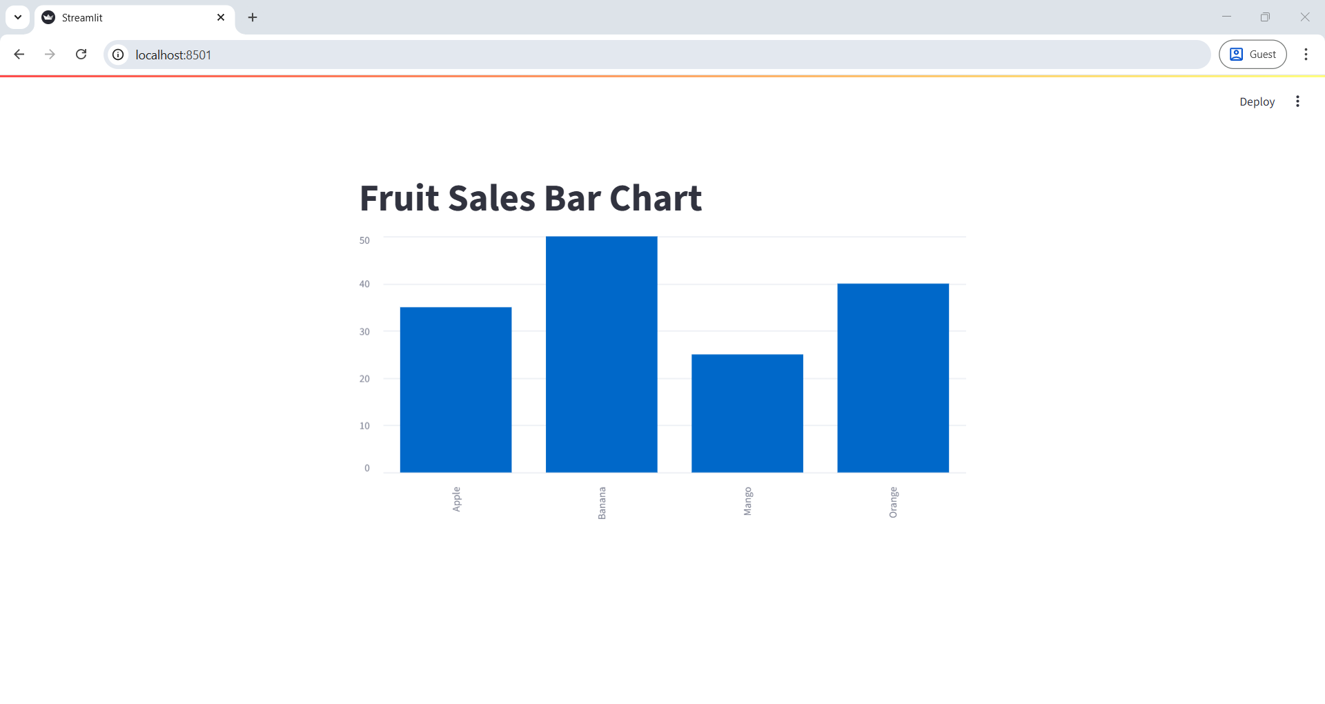
    "Fruits": ["Apple", "Banana", "Mango", "Orange"],
    "Sales": [35, 50, 25, 40]
})

st.title("Fruit Sales Bar Chart")

# Set Fruits as index for chart
data = data.set_index("Fruits")

# Display bar chart
st.bar_chart(data)
✔ What happens?
- X-axis → Fruits
- Y-axis → Sales
- Streamlit automatically renders the chart
The output of the above code is shown below:

Example 2: Multiple Columns (Grouped Bars)
Python
import streamlit as st
import pandas as pd

data = pd.DataFrame({
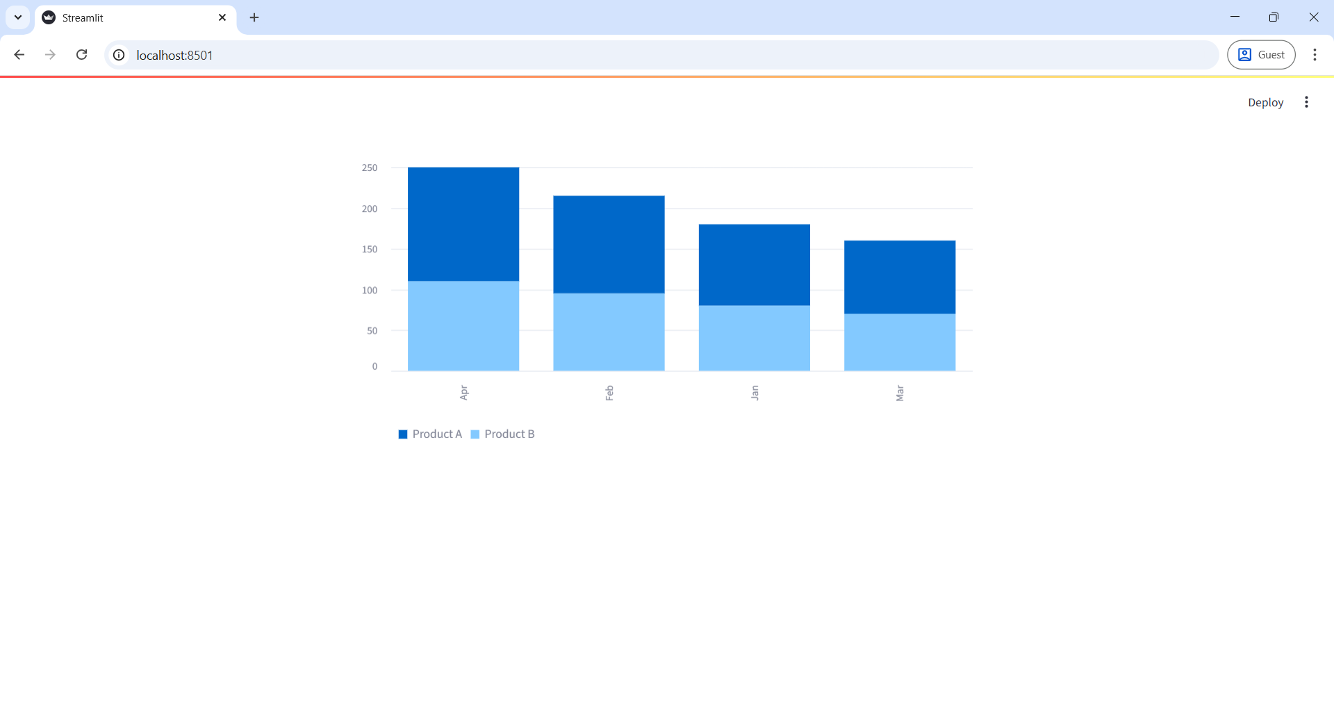
    "Month": ["Jan", "Feb", "Mar", "Apr"],
    "Product A": [100, 120, 90, 140],
    "Product B": [80, 95, 70, 110]
})

data = data.set_index("Month")

st.bar_chart(data)
Output: Each month shows grouped bars for Product A and Product B.
The output of the above code is shown below:
