st.line_chart() in Streamlit
The line_chart method is a quick and easy way to draw line charts in Streamlit using simple data structures such as lists, NumPy arrays, or pandas DataFrames.
It is ideal for visualizing trends such as sales over time, temperature changes, or performance metrics.
Syntax
st.line_chart(
    data=None,
    *,
    x=None,
    y=None,
    x_label=None,
    y_label=None,
    color=None,
    width=None,
    height=None,
    use_container_width=True
)
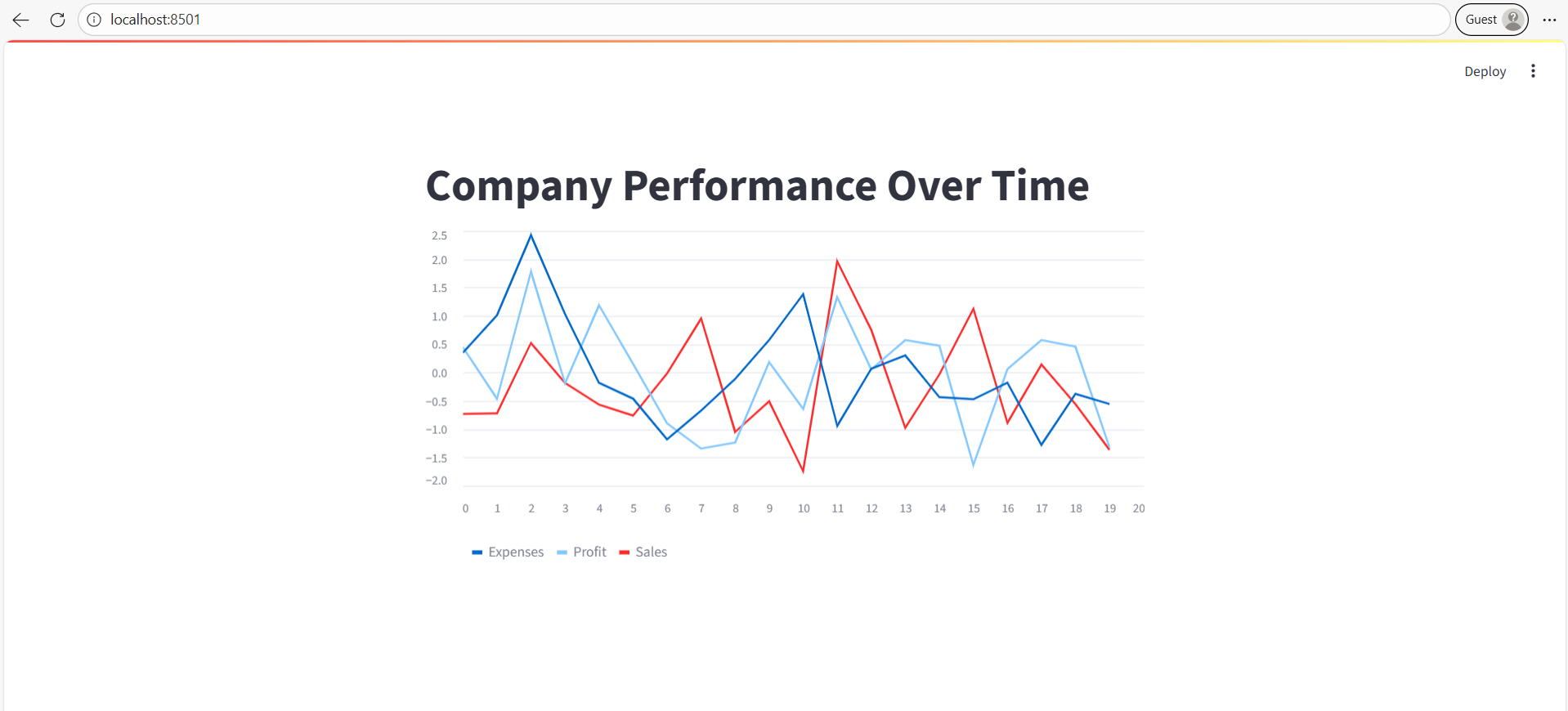
Example: Basic line chart example.
Python
# Import the Streamlit library
import streamlit as st
import pandas as pd
import numpy as np

# Create a sample DataFrame
data = pd.DataFrame(
    np.random.randn(20, 3),  # 20 rows, 3 columns of random numbers
    columns=['Sales', 'Profit', 'Expenses']
)

# Add a title
st.title("Company Performance Over Time")

# Display the line chart
st.line_chart(data)
The output of the above code is shown below:
